Analysing Hacker News Metadata with R
This page provides a set of examples showing how you can extract various statistics from Hacker News metadata using R: simple statistics such as top domains and top commenters as well as more complex things like charting activity patterns of specific users and activity outlier detection. You can use the thumbnails to scroll down and just take a quick look at the charts or you can go through the whole document and even run the code on your machine for the full experience.
About me and disclaimer You can find more about me on my homepage. I'm interested in data and visualisation. I learned R while creating the examples below so don't take them for granted. If you notice any errors/mistakes or you know how to do the same things better please let me know! Let me know as well if you found this page useful or interesting!
Loading the datasets
If you want to run the the code snippets on this page yourself and perhaps do some experiments of your own you're going to need to clone and extract the datasets from Github. You'll also have to download and install R or R Studio (a lightweight IDE for R).
Once you've got hn_posts.csv and hn_comments.csv on your machine, the first thing you want to do is run the code below to load both datasets into R data frames and parse timestamp strings into POSIXct date-time objects. We also set the global time zone and change it for each timestamp as well. I've chosen EST time zone because presumably the majority of HN users are based in the US and also because EST time is closer to Europen time zones than PST.
Before you run the code below remember to change the paths of the data files to where you have extracted them.
This code block is pretty slow and might take around 5 minutes depending on your machine (there are ways to optimize this. I have not done that, however, in order to keep things simple).
Sys.setenv(TZ="America/New_York")
all_posts = read.csv('csv/hn_posts.csv')
all_posts$created_at = as.POSIXct(strptime(all_posts$created_at, "%Y-%m-%dT%H:%M:%SZ"), "UTC")
attr(all_posts$created_at, 'tzone') = 'America/New_York'

all_comments = read.csv('csv/hn_comments.csv')
all_comments$created_at = as.POSIXct(strptime(all_comments$created_at, "%Y-%m-%dT%H:%M:%SZ"), "UTC")
attr(all_comments$created_at, 'tzone') = 'America/New_York'
If you are new to R it might be useful to know that you can type in ?command into console in order to find out what the command does. For example:
?read.csv
Code below outputs top rows of all_comments and all_posts data frames. Note that rows are sorted by date, that's because they were already sorted in the csv files.
head(all_posts)
##   id          created_at    username             domain points
## 1  1 2006-10-09 14:21:51          pg    ycombinator.com     39
## 2  2 2006-10-09 14:30:28     phyllis     paulgraham.com     12
## 3  3 2006-10-09 14:40:33     phyllis foundersatwork.com      7
## 4  4 2006-10-09 14:47:42 onebeerdave      avc.blogs.com      6
## 5  5 2006-10-09 14:51:04      perler     techcrunch.com      6
## 6  6 2006-10-09 14:56:40      perler    360techblog.com      5
head(all_comments)
##   id parent_id          created_at      username points
## 1 15         1 2006-10-09 15:51:01          sama      3
## 2 17        15 2006-10-09 15:52:45            pg      4
## 3 22        21 2006-10-09 22:18:22            pg      1
## 4 23        20 2006-10-09 22:30:53 starklysnarky      2
## 5 30        29 2006-10-10 11:34:59          spez      0
## 6 31        30 2006-10-10 11:40:05            pg      1
Simple statistics
How many posts and comments are there in the datasets in total?
nrow(all_posts)
## [1] 895782
nrow(all_comments)
## [1] 4670226
Top 10 users by number of comments
all_comments$count = 1
users = aggregate(count ~ username, all_comments, sum)
users = users[with(users, order(-count)), ]
head(users, n=10)
##          username count
## 124776    tptacek 23558
## 56017    jacquesm 14667
## 64003    jrockway 12381
## 122640      Tichy  9444
## 94743          pg  9393
## 100691    rbanffy  8943
## 29365      davidw  8502
## 115438 stcredzero  8280
## 38779         eru  7954
## 93100     patio11  7250
Top 10 users by total number of points on their comments
users = aggregate(points ~ username, all_comments, sum)
users = users[with(users, order(-points)), ]
head(users, n=10)
##         username points
## 124776   tptacek 151719
## 94743         pg 103765
## 93100    patio11  78286
## 56017   jacquesm  63419
## 64003   jrockway  52829
## 36445     edw519  44850
## 29365     davidw  32145
## 59150       jerf  30085
## 135    _delirium  30035
## 99565  raganwald  29677
Top 10 users by number of posts
all_posts$count = 1
users = aggregate(count ~ username, all_posts, sum)
users = users[with(users, order(-count)), ]
head(users, n=10)
##         username count
## 16081       cwan  6966
## 66018 shawndumas  4984
## 23544      evo_9  4593
## 52424      nickb  4276
## 32455   iProject  4237
## 21738     edw519  3745
## 10148   bootload  3592
## 53644     nreece  3272
## 61856       robg  2966
## 26217    Garbage  2962
Top 10 users by number of points for posts
users = aggregate(points ~ username, all_posts, sum)
users = users[with(users, order(-points)), ]
head(users, n=10)
##            username points
## 43285       llambda  53454
## 25030         fogus  47832
## 14800   ColinWright  45959
## 16081          cwan  45811
## 56629            pg  39401
## 66018    shawndumas  35731
## 68870     ssclafani  35010
## 23544         evo_9  32698
## 16827 DanielRibeiro  31645
## 52424         nickb  29598
Top 10 domains. Note that #1 represents posts with no domain: 'Show HN', 'Ask HN' and the like.
all_posts$count = 1
domains = aggregate(count ~ domain, all_posts, sum)
domains = domains[with(domains, order(-count)), ]
head(domains, n=10)
##                  domain count
## 1                       67602
## 114587   techcrunch.com 20097
## 85822       nytimes.com 12610
## 132330      youtube.com 11467
## 50984        github.com 10803
## 7263    arstechnica.com  9007
## 129781        wired.com  7184
## 97549  readwriteweb.com  5310
## 75179      mashable.com  5239
## 9835          bbc.co.uk  4999
Top 10 by who have posted most of the .co.uk links
couk_posts = all_posts[grep('co.uk', all_posts$domain), ]
users = aggregate(count ~ username, couk_posts, sum)
users = users[with(users, order(-count)), ]
head(users, n=10)
##             username count
## 2530        iProject   382
## 1163     ColinWright   332
## 4726 RiderOfGiraffes   308
## 789         bootload   197
## 400        anons2011   186
## 669       bensummers   174
## 4272         paulund   172
## 3976           nickb   171
## 2131        gibsonf1   138
## 1267            cwan   121
Plotting user activity patterns
Let's look into how to visualise user activity. For that we have to select specific user's posts and comments into separate data frames. I'll use the top user by number of points in the code and then also plot the rest of the top 5 users.
username = 'tptacek'
users_comments = all_comments[all_comments$username == username, ]
users_posts = all_posts[all_posts$username == username, ]
Next we're going to split the timestamps of both datasets into minutes (y axis) and dates (x axis). Running the code below creates 4 arrays: dates arrays contain post/comment dates and minute arrays contain minutes past the date the post/comment was made.
comment_dates = trunc(users_comments$created_at, 'days')
comment_minutes = difftime(users_comments$created_at, comment_dates, units='mins')
post_dates = trunc(users_posts$created_at, 'days')
post_minutes = difftime(users_posts$created_at, post_dates, units='mins')
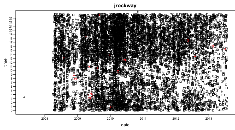
We're going to plot comments first (black squares), then posts (red squares), and then draw ticks and labels on the y axis.
# set parameters for the next thing to be drawn
par(mar=c(3, 3, 2, 0), mgp=c(1.5,0.2,0), las=1, cex.axis=0.7, pch=22)
# plot comments
plot(comment_dates, comment_minutes, ylim=c(0,1439), xlab='date', ylab='time', main=username, yaxt='n')
# plot posts in red
points(post_dates, post_minutes, col='red', pch=22)
# set parameters for the next thing to be drawn (axis)
par(mgp=c(1,0.6,0), las=1)
# draw y axis
axis(2, at=0:23*60, cex.axis=0.7, labels=0:23)
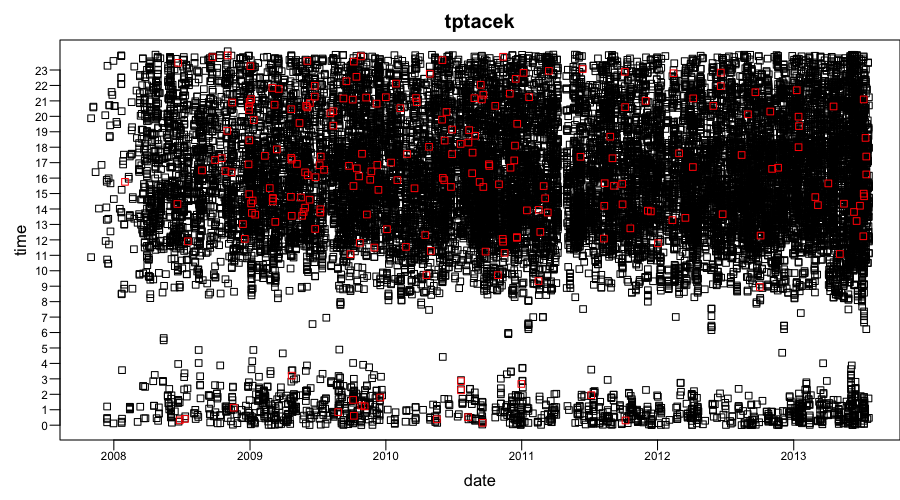
Notice the gap somewhere between 2:00 and 10:00. Presumably this is night time in this particular user's timezone. Likely this user is located in the PST timezone, which is 3 or 4 hours behind EST depending on daylight saving periods.
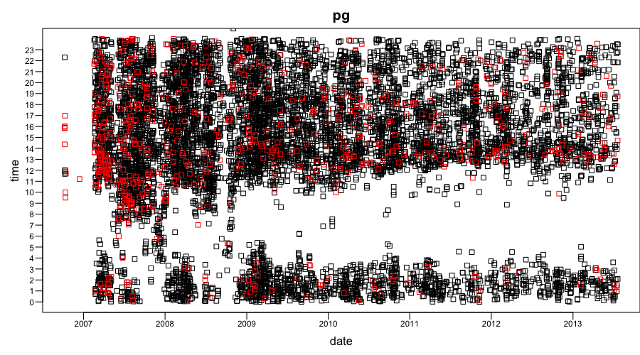
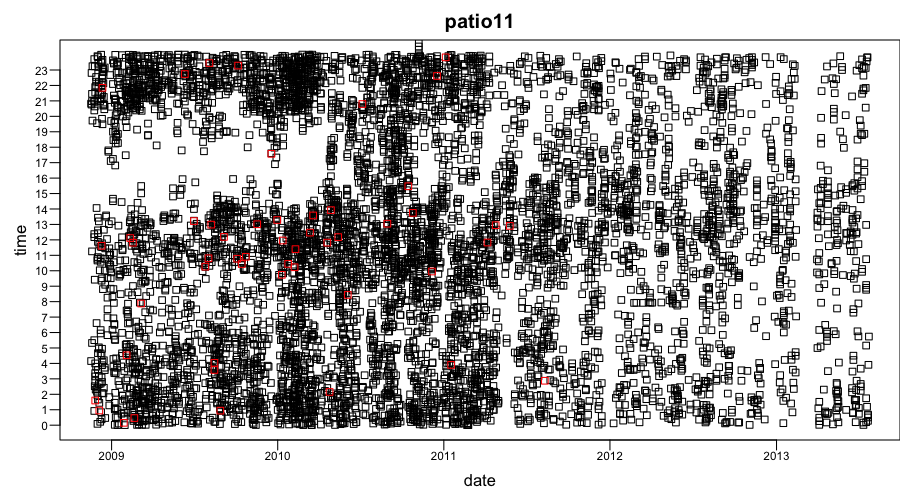
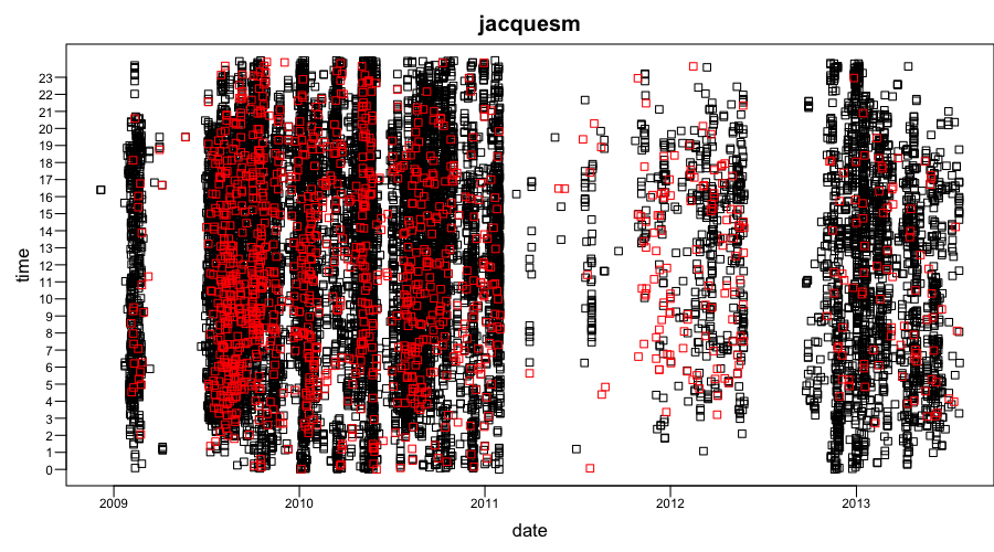
Below find other top 5 users' charts. One thing that struck me about those charts is the lack of apparent sleep patterns in some of them. Other than that I will leave the reader to make their own conclusions.
Using xts to aggregate and filter time series
xts is a handy library for working with time series data in R. Before you start using it, however, you have to install it using the commands below:
install.packages("xts")
require(xts)
In order to harness xts functionality we need to create an xts object. The first thing we do below is create an xts object with only a date index and then add a column called count which is equal to 1 for all dates (this will help us with aggregation).
Note that the rest of this text only deals with HN posts. The same commands should work for comments as well though.
all_posts_xts = xts(order.by = all_posts$created_at)
all_posts_xts = merge(all_posts_xts, count = 1)
head(all_posts_xts)
##                     count
## 2006-10-09 14:21:51     1
## 2006-10-09 14:30:28     1
## 2006-10-09 14:40:33     1
## 2006-10-09 14:47:42     1
## 2006-10-09 14:51:04     1
## 2006-10-09 14:56:40     1
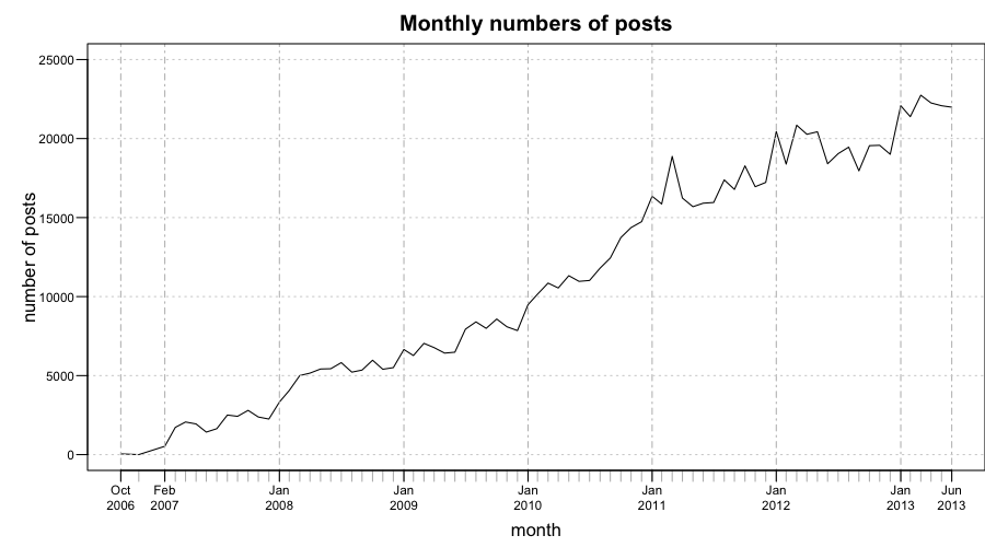
Once we have an xts object we can use various aggregation and filtering functions. For example, let's aggregate the dates by month and plot the resulting object.
monthly_xts = apply.monthly(all_posts_xts, sum)
# Remove the last month since it does not contain full data
monthly_xts = monthly_xts[!time(monthly_xts) %in% time(last(monthly_xts))]
par(mar = c(3.5, 4, 2, 0), las = 1, cex.axis = 0.7)
plot(monthly_xts, ylim = c(0, 25000), xlab = "month", ylab = "number of posts",
    main = "Monthly numbers of posts", mgp = c(2.2, 1, 0), yaxt = "n", major.ticks = "years")
par(mgp = c(3, 0.6, 0))
axis(2, at = 0:5 * 5000, cex.axis = 0.7, labels = 0:5 * 5000)
Let's aggregate post counts by day now
daily_xts = apply.daily(all_posts_xts, sum)
# Remove the last day
daily_xts = daily_xts[!time(daily_xts) %in% time(last(daily_xts))]
par(mar = c(3.5, 4, 2, 0), las = 1, cex.axis = 0.7)
plot(daily_xts, ylim = c(0, 1100), xlab = "day", ylab = "number of posts", main = "Daily numbers of posts",
    mgp = c(2.2, 1, 0), yaxt = "n", major.ticks = "years")
par(mgp = c(1, 0.8, 0))
axis(2, at = 0:11 * 100, cex.axis = 0.7, labels = 0:11 * 100)
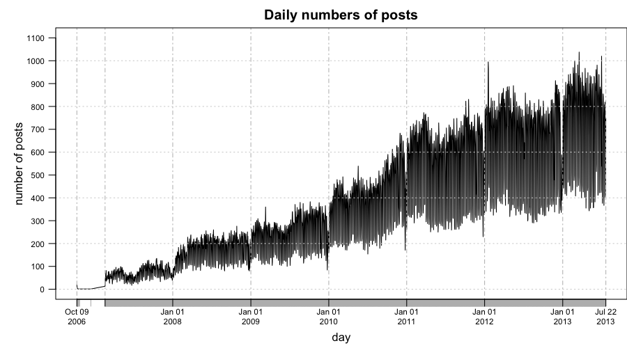
In the chart above it seems as though the number of posts varies a lot day to day. It's hard to see what's really happening here because a lot of the data points might be covered by lines connecting them. Let's try and draw the same plot, except for each data point we draw a little circle and no lines to connect them.
par(mar = c(3.5, 4, 2, 0), las = 1, cex.axis = 0.7)
plot(daily_xts, ylim = c(0, 1100), xlab = "day", ylab = "number of posts", main = "Daily numbers of posts",
    mgp = c(2.2, 1, 0), yaxt = "n", major.ticks = "years", type = "p")
par(mgp = c(1, 0.8, 0))
axis(2, at = 0:11 * 100, cex.axis = 0.7, labels = 0:11 * 100)
.png)
There are two lines or two clusters of data points. Presumably the upper one contains weekday data points and the one below contains weekends. To make sure it's true we will color weekends in red.
par(mar = c(3.5, 4, 2, 0), las = 1, cex.axis = 0.7)
plot(daily_xts[.indexwday(daily_xts) %in% 1:5], ylim = c(0, 1100), xlab = "day",
    ylab = "number of posts", main = "Daily numbers of posts (weekends in red)",
    mgp = c(2.2, 1, 0), yaxt = "n", major.ticks = "years", type = "p")
points(daily_xts[.indexwday(daily_xts) %in% c(0, 6)], type = "p", col = "red")
par(mgp = c(1, 0.8, 0))
axis(2, at = 0:11 * 100, cex.axis = 0.7, labels = 0:11 * 100)
.png)
Outlier detection
In the previous chart we can observe that weekdays have quite some outliers. Weekends seem to have only a few outliers on the days that fall just before the new year. The weekday outliers are presumably holidays. Assuming that the majority of HN readers are from the US those should be US holidays.
For the sake of simplicity let's only look at the dates starting from the 1st of January 2012 and ending on the 22nd July 2013 (the last full day on the dataset).
weekdays_xts = daily_xts[.indexwday(daily_xts) %in% 1:5]
weekdays_xts = weekdays_xts["2012-01-01::2013-07-22"]
par(mar = c(3.5, 4, 2, 0), las = 1, cex.axis = 0.7)
head(weekdays_xts)
##                     count
## 2012-01-02 23:59:22   571
## 2012-01-03 23:59:15   768
## 2012-01-04 23:57:52   790
## 2012-01-05 23:58:12   767
## 2012-01-06 23:55:36   684
## 2012-01-09 23:59:14   808
plot(weekdays_xts, ylim = c(200, 1100), xlab = "day", ylab = "number of posts",
    main = "Daily numbers of posts on weekdays", mgp = c(2.2, 1, 0), yaxt = "n",
    major.ticks = "months")
par(mgp = c(1, 0.8, 0))
axis(2, at = 2:11 * 100, cex.axis = 0.7, labels = 2:11 * 100)
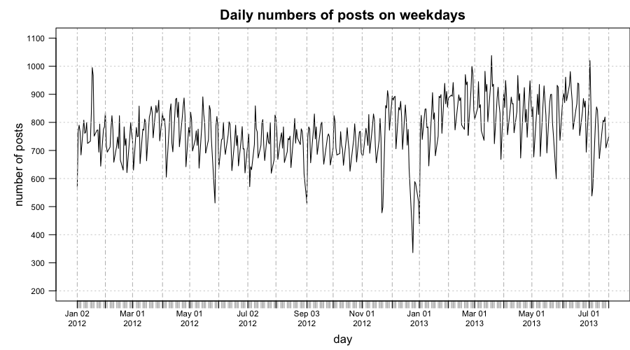
To avoid/minimize the effects of trend and seasonality we're going to smooth the curve using lowess smoother and then find outliers on the residuals we'll get after subtracting every datapoint from its smoothed value.
datapoints = coredata(weekdays_xts)[, 1]
smoothed_datapoints = lowess(datapoints, f = 1/10)
index = index(weekdays_xts)
par(mar = c(3.5, 4, 2, 0), las = 1, cex.axis = 0.7)
plot(weekdays_xts, ylim = c(200, 1100), xlab = "day", ylab = "number of posts",
    main = "Daily numbers of posts on weekdays", mgp = c(2.2, 1, 0), yaxt = "n",
    major.ticks = "months")
lines(index, smoothed_datapoints$y, col = "red")
axis(2, at = 2:11 * 100, cex.axis = 0.7, labels = 2:11 * 100)
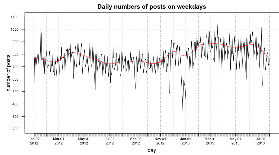
Let's see how the detrended graph looks like and mark the outliers with red circles.
weekdays_residuals = datapoints - smoothed_datapoints$y
weekdays_residuals_xts = xts(weekdays_residuals, order.by = index(weekdays_xts))
par(mar = c(3.5, 3, 2, 0), las = 1, cex.axis = 0.7)
plot(weekdays_residuals_xts, ylim = c(-500, 300), xlab = "day", ylab = "residual",
    main = "Residuals + outliers marked", mgp = c(2.2, 1, 0), yaxt = "n", major.ticks = "months")
outliers = boxplot.stats(weekdays_residuals)$out
points(index[which(weekdays_residuals %in% outliers)], weekdays_residuals[which(weekdays_residuals %in%
    outliers)], col = "red")
axis(2, at = -5:3 * 100, cex.axis = 0.7, labels = -5:3 * 100)
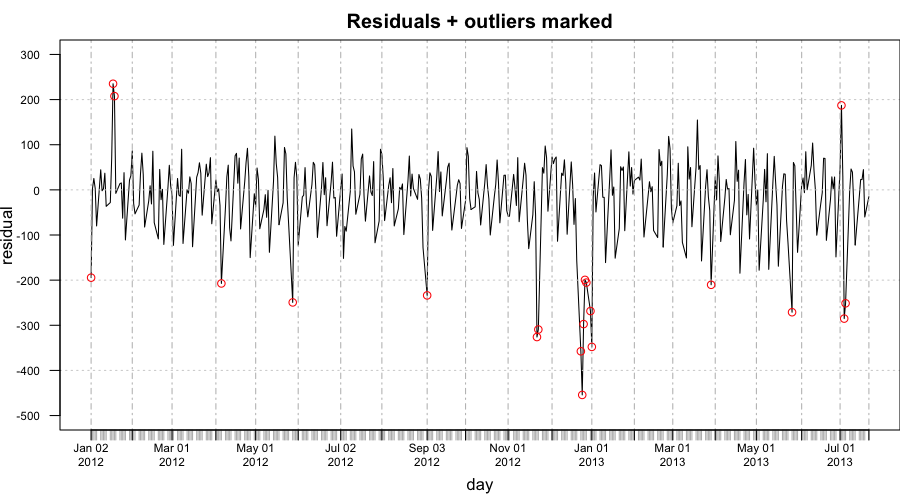
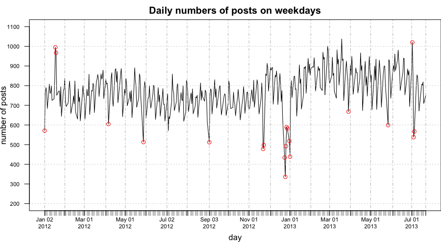
Next we output the outlier dates and draw the original weekday chart with outliers marked
# outliers that have unusually high daily number of posts
outliers_high = outliers[outliers > 0]
# outliers that have unusually low daily number of posts
outliers_low = outliers[outliers < 0]
index[which(weekdays_residuals %in% outliers_high)]
## [1] "2012-01-18 23:55:15 EST" "2012-01-19 23:57:52 EST"
## [3] "2013-07-02 23:59:23 EDT"
index[which(weekdays_residuals %in% outliers_low)]
##  [1] "2012-01-02 23:59:22 EST" "2012-04-06 23:58:42 EDT"
##  [3] "2012-05-28 23:57:56 EDT" "2012-09-03 23:59:24 EDT"
##  [5] "2012-11-22 23:58:57 EST" "2012-11-23 23:55:45 EST"
##  [7] "2012-12-24 23:56:51 EST" "2012-12-25 23:57:26 EST"
##  [9] "2012-12-26 23:54:26 EST" "2012-12-27 23:55:58 EST"
## [11] "2012-12-28 23:57:53 EST" "2012-12-31 23:53:29 EST"
## [13] "2013-01-01 23:55:03 EST" "2013-03-29 23:57:17 EDT"
## [15] "2013-05-27 23:52:01 EDT" "2013-07-04 23:52:44 EDT"
## [17] "2013-07-05 23:58:14 EDT"
par(mar = c(3.5, 3, 2, 0), las = 1, cex.axis = 0.7)
plot(weekdays_xts, ylim = c(200, 1100), xlab = "day", ylab = "number of posts",
    main = "Daily numbers of posts on weekdays", mgp = c(2.2, 1, 0), yaxt = "n",
    major.ticks = "months")
points(index[which(weekdays_residuals %in% outliers)], datapoints[which(weekdays_residuals %in%
    outliers)], col = "red")
axis(2, at = 2:11 * 100, cex.axis = 0.7, labels = 2:11 * 100)
Attempting to explain the outliers
Most outliers are related to low numbers of posts due to holidays some of which are common to both US and Europe (e.g. Christmas), others only present only in the US (e.g. Thanksgiving).
Christmas period is the largest outlier, this is probably because it's a holiday that's common across so many different countries. However, Thanksgiving is quite a large outlier too, that is probably because the majority of HN users are based in the US.
It's interesting that the 3 high outliers are not holidays but are very close to holidays. The 18th and the 17th of Jan 2012 are high outliers that come after the 16th of Jan which is Birthday of Martin Luther King, Jr. and the 2nd of July is very close to the 4th of July (Independence Day). Either there were more interesting news items during those days or people were reading and posting more stories for some other reason.
| Unusually low values | |
| 2012-01-02 | New Year's Day |
| 2012-04-06 | Good Friday |
| 2012-05-28 | Memorial Day |
| 2012-09-03 | Labor Day |
| 2012-11-22 | Thanksgiving Day |
| 2012-11-23 | Day after Thanksgiving |
| 2012-12-24 | Christmas Season |
| 2012-12-25 | Christmas Day |
| 2012-12-26 | Christmas Season |
| 2012-12-27 | Christmas Season |
| 2012-12-28 | Christmas Season |
| 2012-12-31 | Christmas Season |
| 2013-01-01 | New Year's Day |
| 2013-03-29 | Good Friday |
| 2013-05-27 | Memorial Day |
| 2013-07-04 | Independence Day |
| 2013-07-05 | Day after Independence Day |
| Unusually high values | |
| 2012-01-18 | Soon after Birthday of Martin Luther King, Jr. |
| 2012-01-19 | Soon after Birthday of Martin Luther King, Jr. |
| 2013-07-02 | July 4th approaching |
Final word
I hope the examples will be useful for someone as a learning material or someone will enjoy seeing the HN stats charts. Please let me know if you do any interesting experiments with the HN metadata posted on Github. To get in touch send me an email or follow me on twitter.
Thanks to Adomas Paltanavičius for proofreading this text.


_thumb.png)
_thumb.png)


