Card list
Learn about the CardList and Card components and how to use them.
Card list is a visual and descriptive way to display links. List is made of 3 columns, each card in a list has to use the image, title and subtitle. This is how the component looks like:
- MarsThe red planet that Musk dreams of.
- JupiterThe largest planed in Solar system.
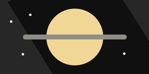
- SaturnThe only planed in Solar system that has a ring.


Add card list
Import the components from the cards folder:
import { Card, CardList } from '../components/cards';Describe the cards with image,title,subtitle and url props:
<CardList>
  <Card title="Mars" subtitle="The red planet that Musk dreams of." image="mars.png" url="/mars-page" />
  <Card title="Jupiter" subtitle="The largest planed in Solar system." image="jupiter.png" url="/jupiter-page" />
  <Card title="Saturn" subtitle="The only planed in Solar system that has a ring." image="saturn.png" url="/saturn-page" />
<CardList>
Customize card list style
Adjust card list visual style in the CardList.tsx and Card.tsx files.